A recipe for success: Reimagining the WildMoose Bakers website
When I first spoke with Phil Vincenty — artisan baker and owner of WildMoose Bakers — about his work, I was humbled to learn about his incredibly long working hours and the dedication it took to transform his passion for baking bread into a living.
Making bread at WildMoose Bakers isn’t just a dream job for Phil — it’s a true labor of love. Phil’s unique artisan breads and pastries not only provide energy and nourishment to consumers with organic and locally-sourced ingredients, but also bring a great joy to their customers. WildMoose Bakers takes a unique approach to baking, drawing on traditional old-world techniques to create new and innovative breads and pastries. It was easy to see how their products quickly became a sensation in their local community of Morrisville, NC.
With demanding hours and the constant pressure of order fulfillments and creating new recipes, it was challenging for Phil to keep his website up to date with their latest products and updates. Phil and his wife Laurel quickly created their website to establish an online presence as WildMoose Bakers gained traction, but keeping up with maintenance was difficult as their business evolved.
Visiting the WildMoose Bakers website immediately evoked a sense of warmth and conveyed a passion for the products, with appetizing images of their breads and pastries accompanied by enticing descriptions. I was excited about the website’s potential to draw in visitors and showcase the bakery’s offerings even more effectively. I quickly began developing a plan for how I could help Phil and Laurel improve their online presentation of WildMoose Bakers to reflect their unique vision.
Research & planning
The first phase of building any new website is research and planning — understanding the client’s target audience and potential visitors, and identifying any challenges with their current website or areas for improvement.
Understanding the audience
The WildMoose Bakers website represents the bakery’s primary online presence. It serves as a central location for all public information about the business, including product images and descriptions, the backstory and team introductions, and contact information.
Who is visiting this website?
There are several potential kinds of visitors; for example:
- First-time visitors who are aware of WildMoose Bakers but want more information
- First-time visitors who stumbled across the site in their search results, who have no background knowledge of WildMoose Bakers
- Returning customers seeking updates on new products
- People researching local bakeries, in general
The WildMoose Bakers website should cater to all of these potential visitors at the same time. In other words, a visitor should not need to have any prior knowledge of the bakery before visiting, and returning visitors should not have to dig through redundant information to find what they’re looking for.
Identifying opportunities for improvement
As I reviewed the WildMoose Bakers website, I began identifying areas where the site could do more to showcase products and information. Here are some of my initial ideas:
-
Improve the overall composition of elements on the page, re-organizing sections, images and text logically to guide the visitor through information on each page.
-
Pair text and images for readabilty and visibility — for example, positioning text/image pairs side-by-side or in card format.
-
Structure calls to action (buttons) to entice the visitor to click.
-
Leverage column and grid layouts for a symmetric appearance, which also helps structure the page content to look great on all screen sizes and expand naturally as content is added.
Design & development
After establishing a direction for development, it was time to get to work on designing and building the new website!
Many website developers who do design work utilize tools like Figma to map out their designs before beginning development. I prefer working with pen and paper first, sketching out ideas freehand to place elements on each page and imagine the flow of information and path of the visitor’s eyes across the content.
From there, I began building the website code, bringing my sketches to life on the page. I experimented with various layouts, colors and typographies, trying to capture the overall feel of the original website while injecting my own creativity and referring back to the areas for improvement.
Preserving the original look and feel
The original WildMoose Bakers website was designed with a lot of love, and it was important to me to preserve key elements of the creators’ chosen look and feel for the website. Using the original logo and colors as a starting point, I developed a new color palette for the site that reflected the same style with some slight alterations for accessibility and sophistication.
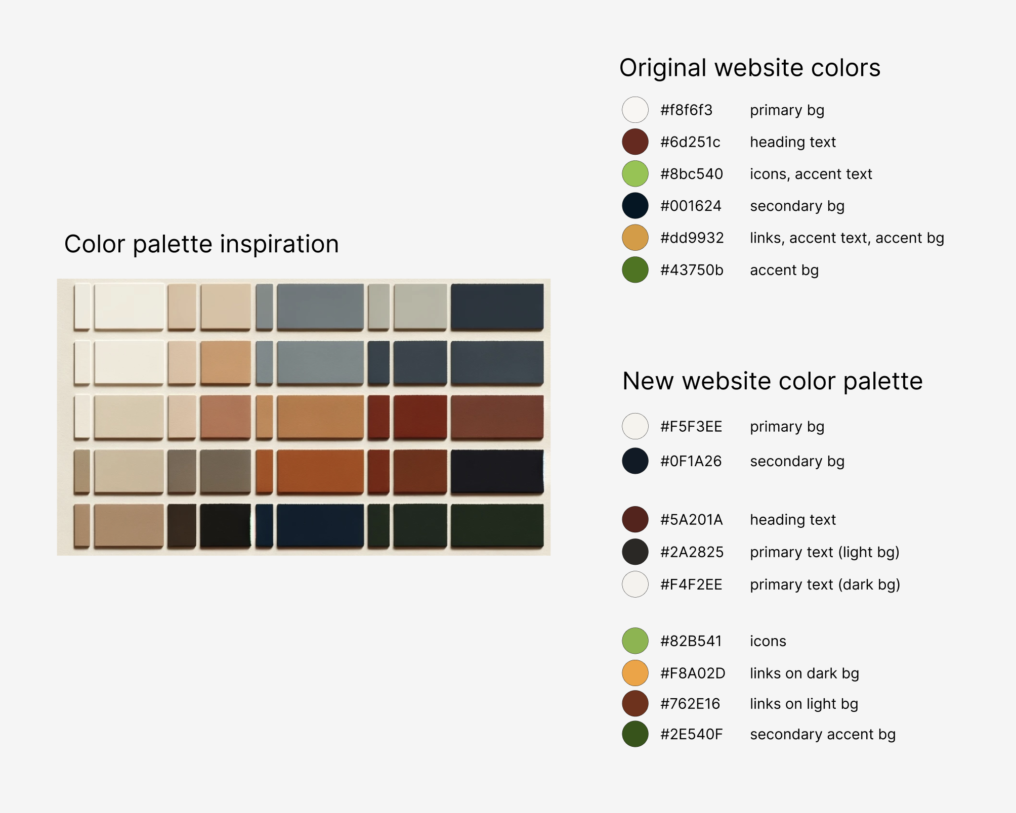
The color palette was tweaked and extended during development, at the root of the project CSS:
  --nav-background: #fffefc;
  --primary-background: #F5F3EE;
  --secondary-background: #0F1A26;
  --accent-background: #2a4612;
  --heading-text: #5A201A;
  --primary-text: #2A2825;
  --secondary-text: #F4F2EE;
  --blockquote-text: #d4d3d2;
  --primary-accent-color: #fdb453;
  --primary-accent-hover: #facc90;
  --secondary-accent-color: #82B541;
  --tertiary-accent-color: #5d2512;
  --tertiary-accent-hover: #833c24;
Reimagining the Home page
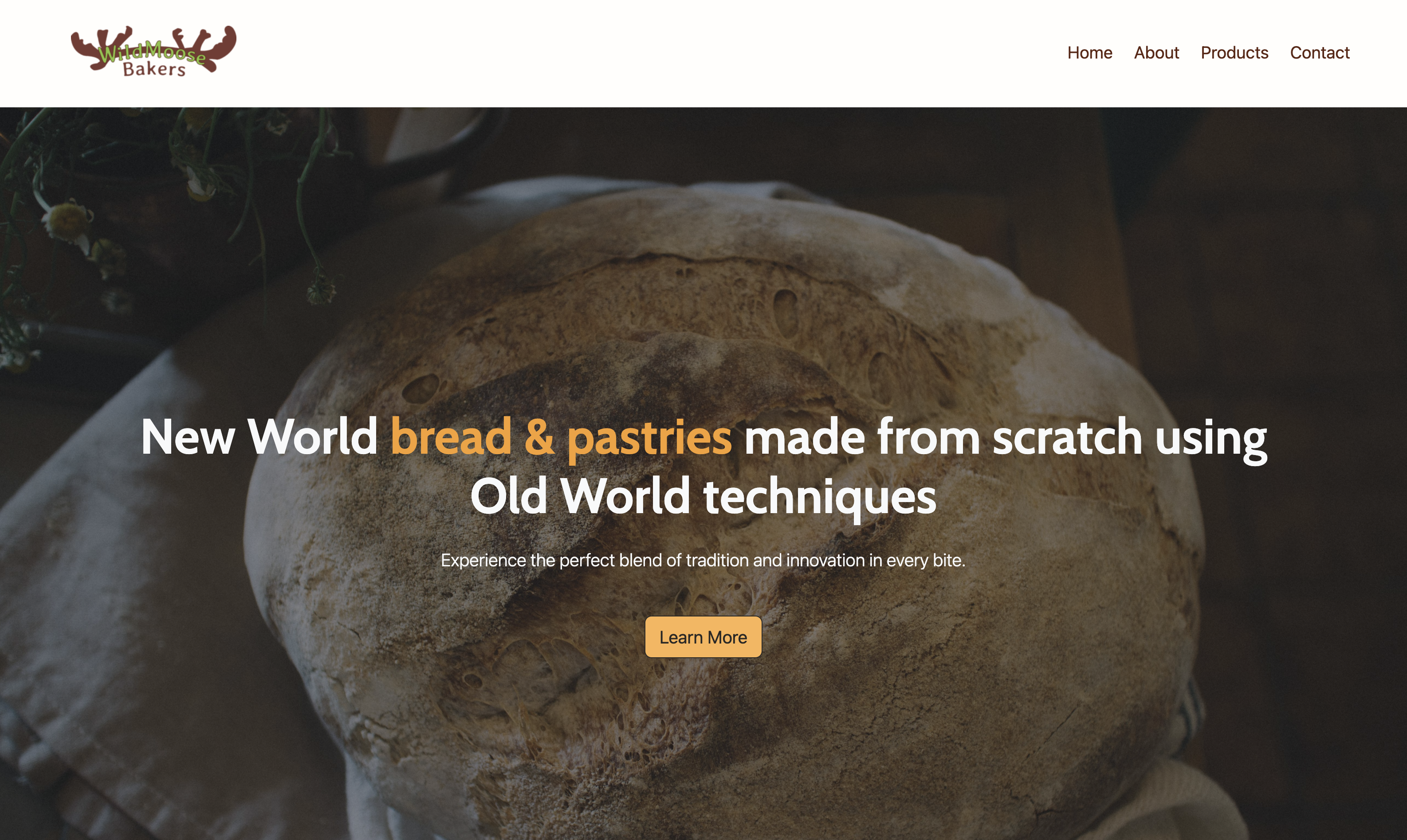
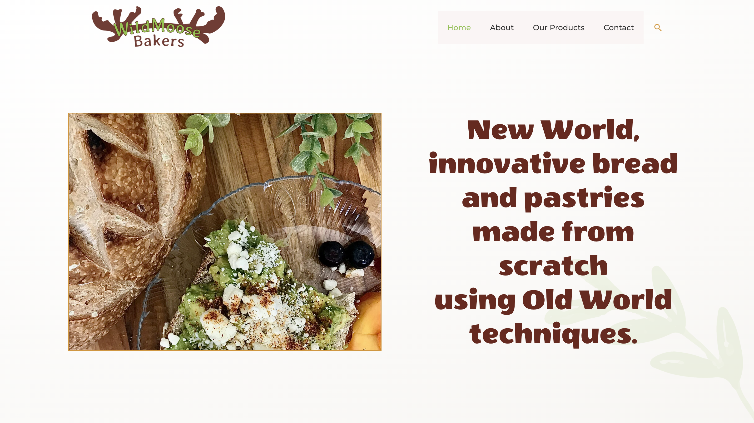
There was a lot to love about the hero section of the original website — the first thing you notice when you open the Home page. The bold text tells the visitor exactly what WildMoose Bakers is all about, paired with an appetizing image.
Original website:
The bakery’s key selling point is the fusion of innovative recipes with traditional techniques, so I really wanted to make this point stand out. I also wanted to emphasize what it is the bakery actually sells — bread and pastries — making it readily apparent to any visitor.
To accomplish this, I decided to float the text above a darkened image and color “bread & pastries” for emphasis. I added an enticing subtext below the heading, and added a call-to-action button labeled Learn More, which simply scrolls the page down to the next section of the page.
New website:
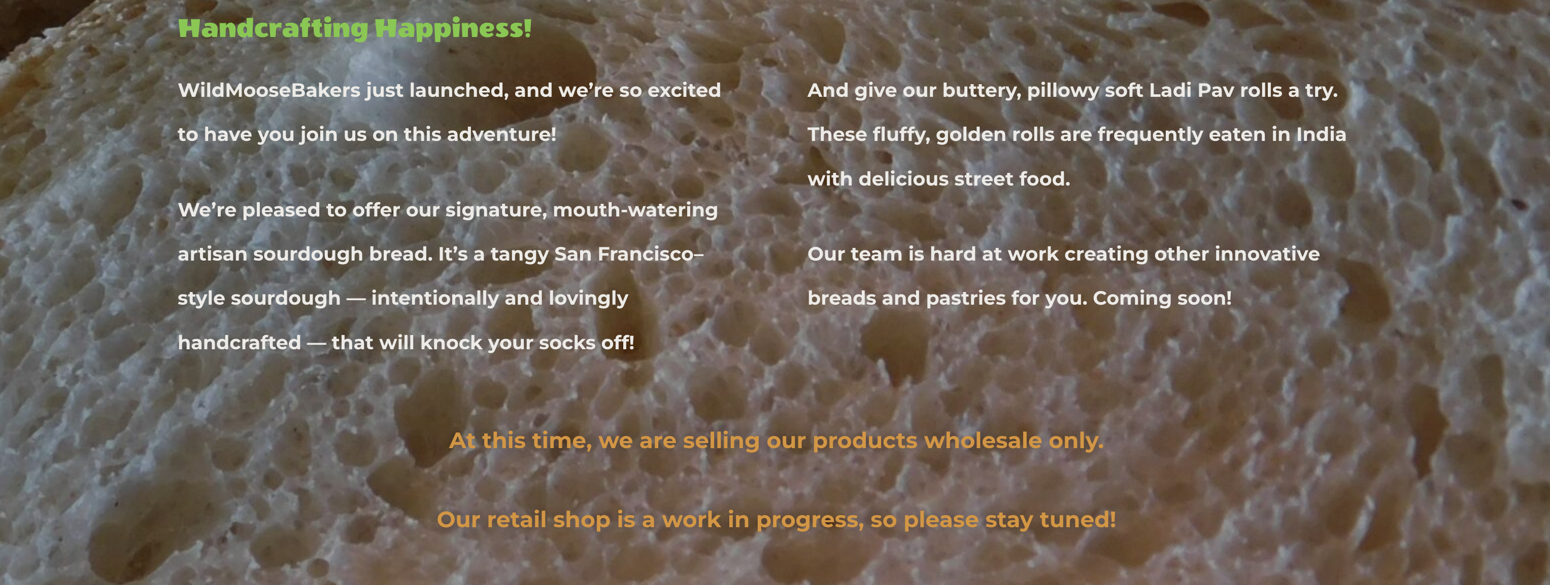
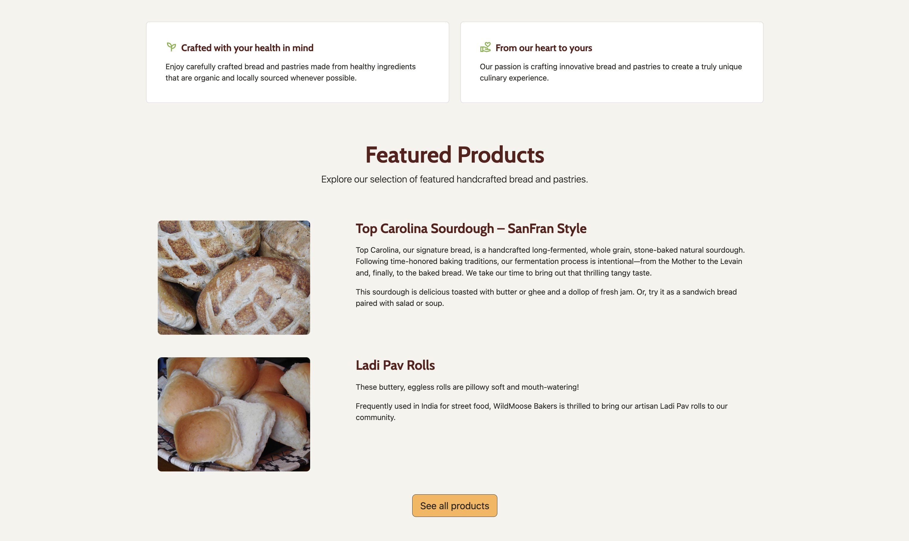
On the original website, below the hero section, there’s some text about the bakery’s featured products.
Original website:
I wanted to maintain the sentiment of the text while reimagining the design and layout. Instead of using text layered over an image, I decided to include the two featured products stacked with side-by-side image and description, as well as two cards with information pulled from the original website’s About page. I’ve also added a See all products button that leads to the Products page.
New website:
Dynamic products page with room to scale
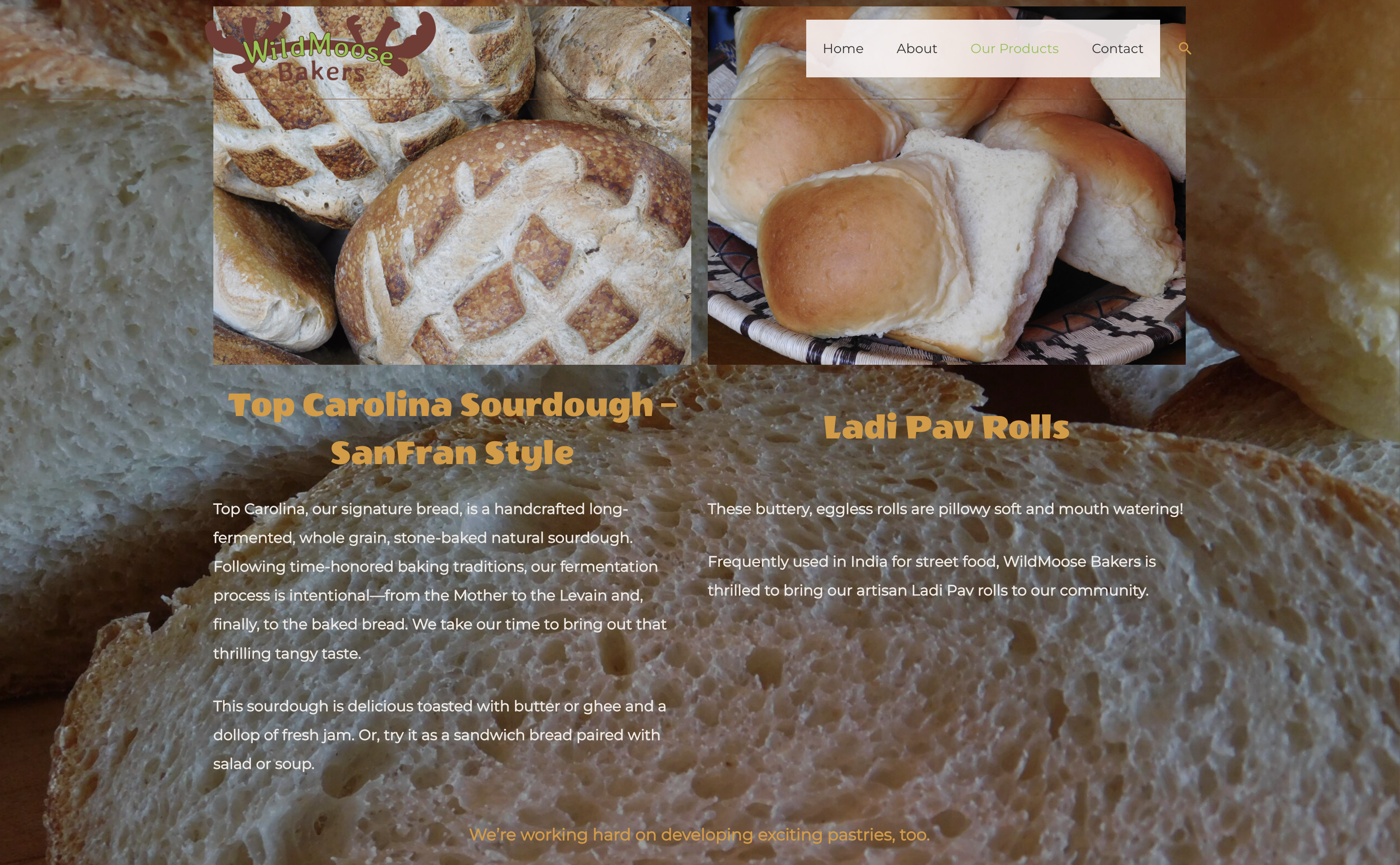
At the time I built this website, WildMoose Bakers had two products, with incredibly appetizing images and mouth-watering descriptions! Unfortunately, on the original website, parts of the images were covered by the navigation, and visitors with limited vision or colorblindness likely would have found it difficult to read the text on this page.
Original website:
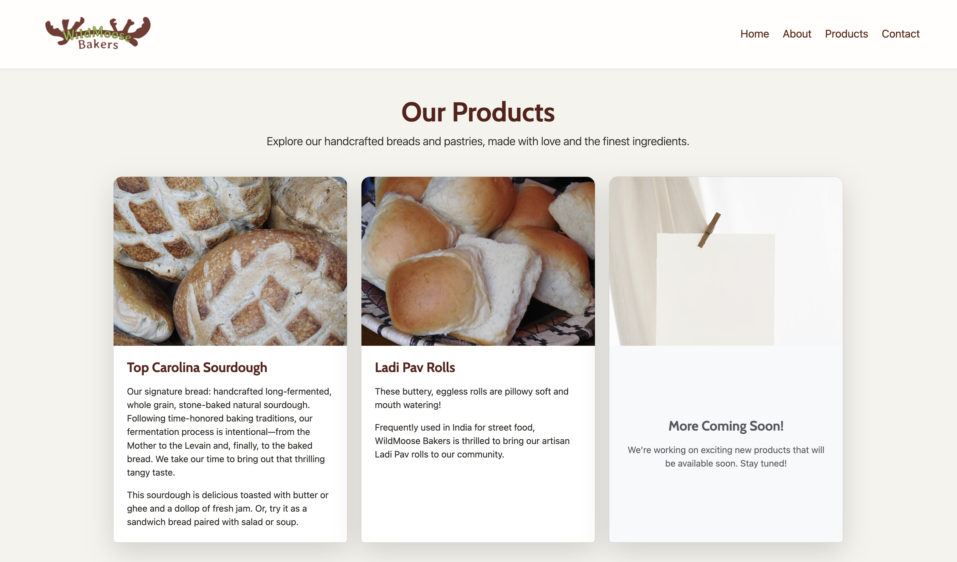
I wanted to redesign this page to really make the images and descriptions pop, and to adjust the colors and contrast so even visitors with impairments could easily read the text. I also knew that the bakery would be adding many more products in the future, so it was important to make the page dynamic — meaning that adding products wouldn’t require additional code; the grid would simply expand to accommodate as many products as necessary.
New website:
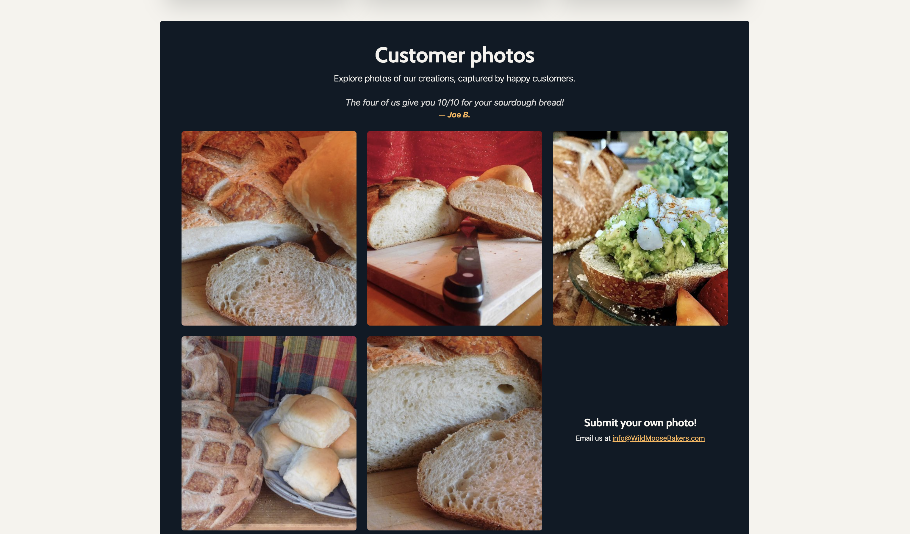
I also added a new section to the products page: a customer photo gallery. I found the photos hidden in a carousel at the bottom of the original website’s About page, but decided to move it to the Products page and redesign it as a grid. Here, all of the great photos are featured right alongside the other product photos, along with an invitation for existing customers to submit their own photo.
New website:
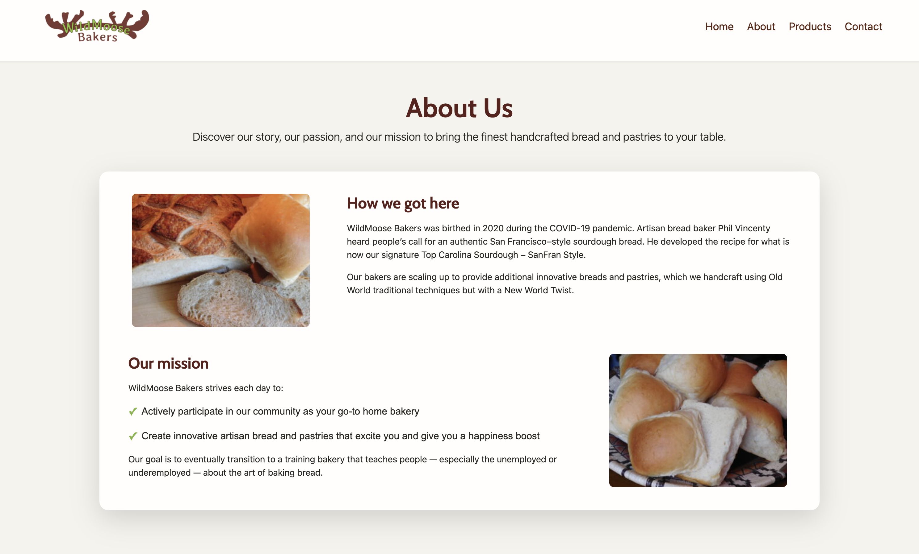
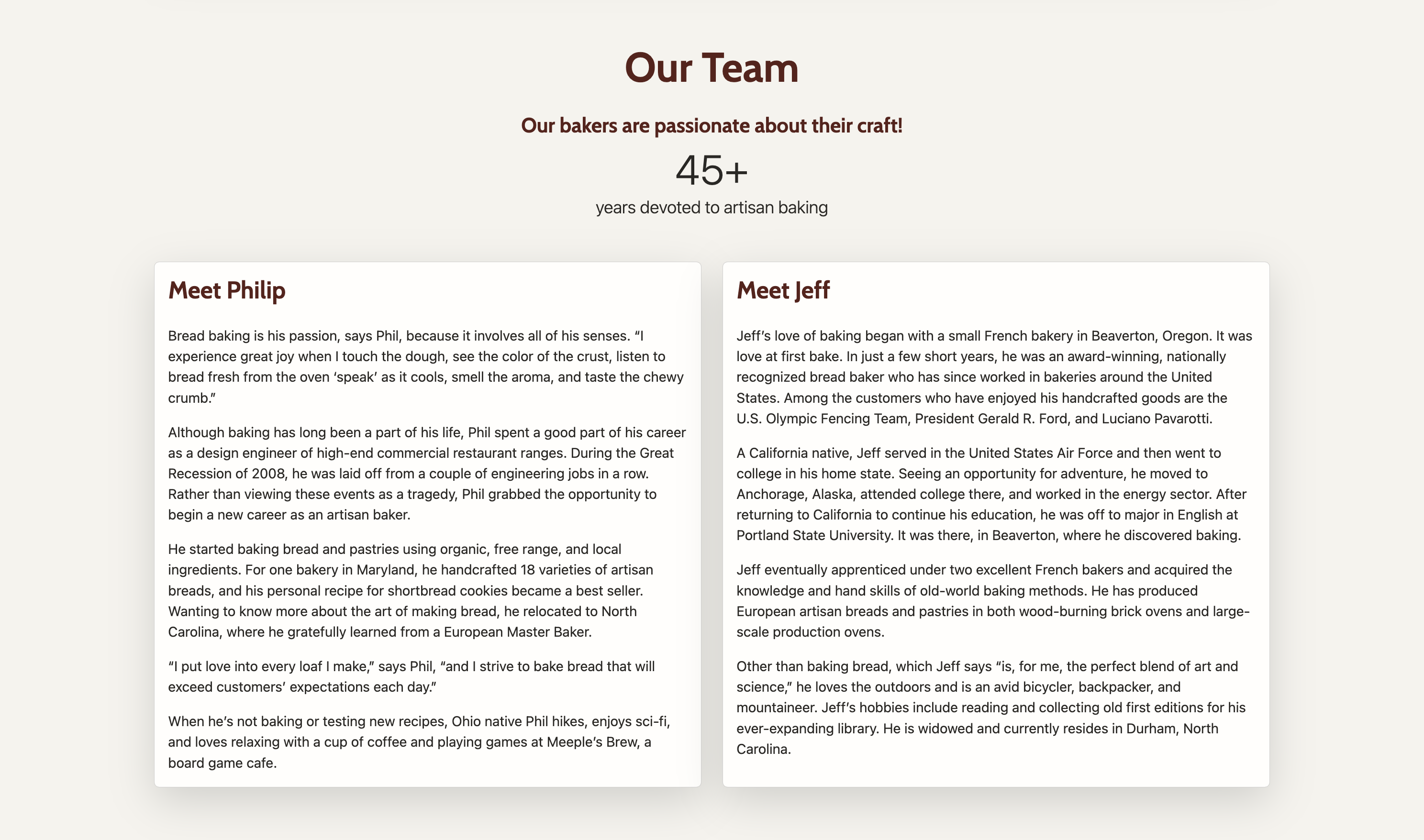
Telling the story of WildMoose Bakers
The original website had a fantastic About page including a short story of how the bakery came to be, the bakery’s mission, and introduction to the two bakers: Phil and Jeff. The original page also included a couple feature cards that I moved to the Home page and the customer photo gallery that I moved to the Products page, so all that was left was to reimagine the layout of the remaining elements on the page.
Original website:
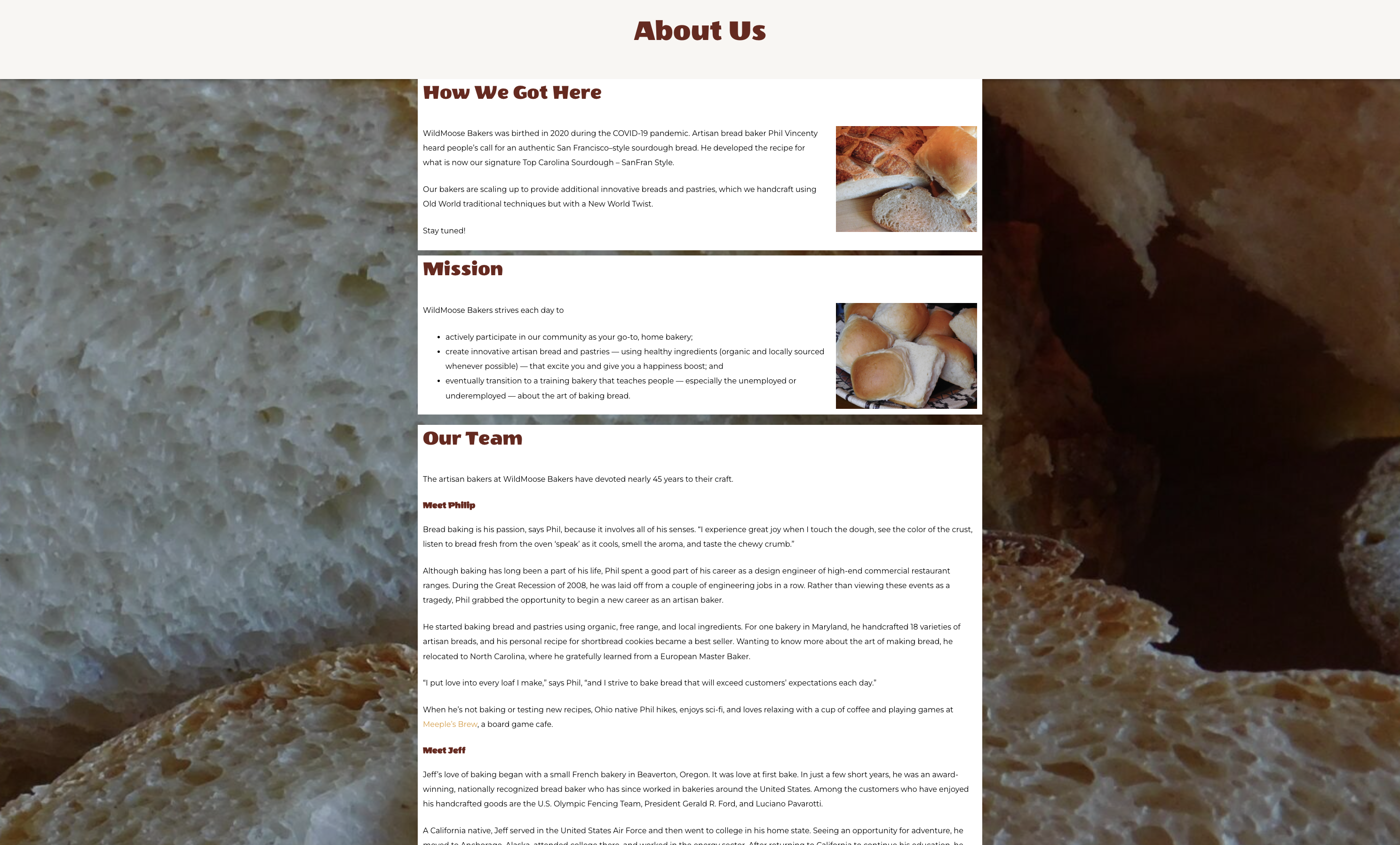
First, I revised the “How we got here” and “Mission” sections, making the layout more dynamic and adding checkmarks to the mission statement for visual interest. Placing the section against a plain background gives the site a modern feel consistent with the other pages.
Next, I decided on a side-by-side layout for the team. I kept the years counter from the original website, which begins at 0 and rapidly ticks up to 45+ once the visitor has brought the page into view. This was a nice touch on the original website, so I wanted to give it a special place in the new design.
New website:
Responsive design for mobile devices
Today, many people visit websites from their phones. It was important to me to make sure the WildMoose Bakers website could be accessed from anywhere on the go. This meant ensuring my designs were responsive for smaller screens, creating a smooth experience when navigating the website on a mobile device.
Where we’re going next
I’m excited to continue working with Phil, Laurel and WildMoose Bakers as they add more products and photos to their website. With a rapidly growing customer base and excitement for their products in their local community, there are so many opportunities for the bakery to build their online presence!